Anatomy of a landing page that converts: the 9 essential sections
By Clément Lacaille · published 15 May 2026 · updated 22 September 2026 · 14 min read · method
10 landing page templates — €89 each
Next.js, one-time payment, full bundle €229
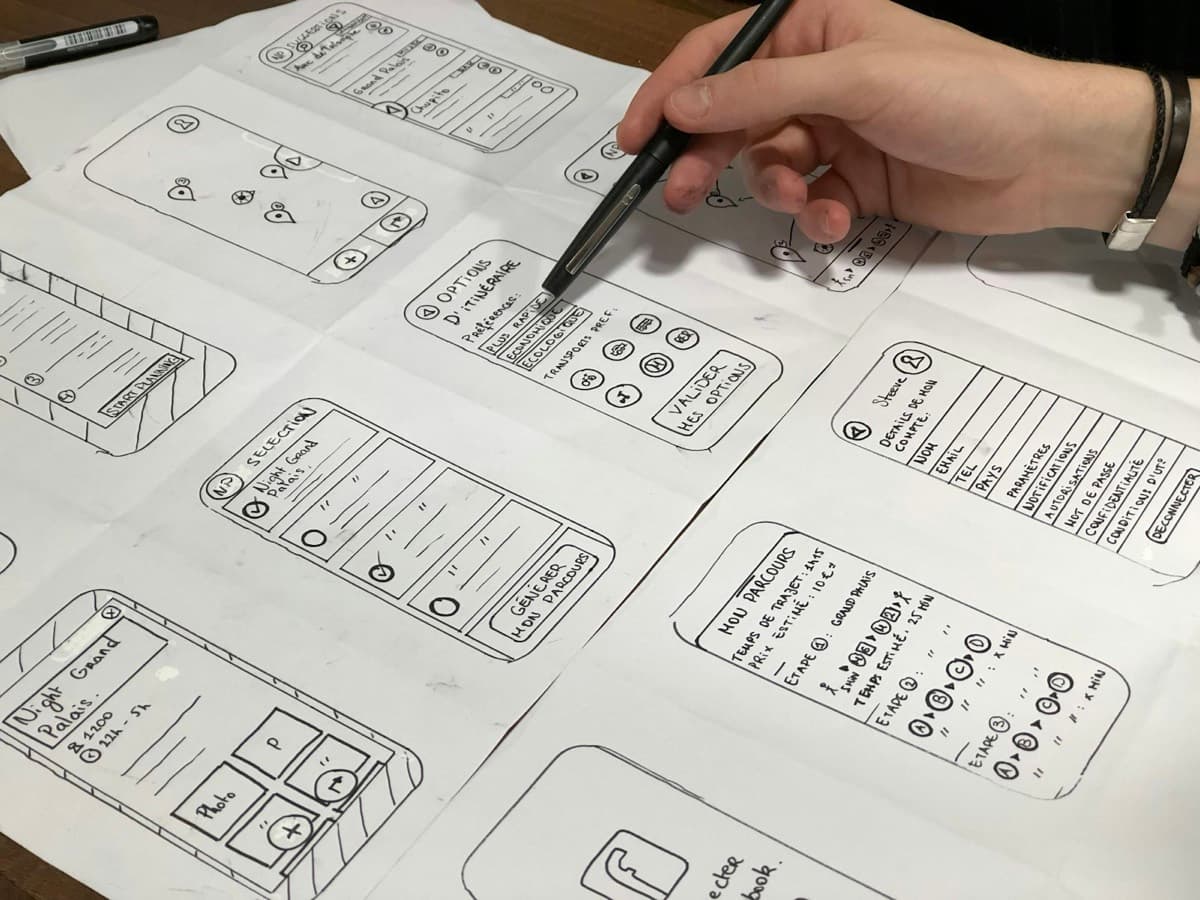
A landing page that converts has nothing to do with a stroke of creative genius. It is an objection-handling machine, section after section, in a precise order. Your visitor arrives sceptical, in a hurry, with ten tabs open. Every block on the page has a single mission: give them a reason to read the next block, all the way to the final click. Here are the 9 sections found on virtually every page that converts above 5%, each with its psychological role and one directly applicable copywriting practice.
1. The hero: convince in 5 seconds
The hero is everything that appears on screen before the first scroll. Its psychological role is brutal: answer the question “am I in the right place?” before the visitor leaves. According to Nielsen Norman Group eye-tracking studies, you have 5 to 10 seconds to capture attention.
An effective hero contains four elements: a benefit-driven headline (the outcome, not the product), a subheadline that says for whom and how, a call to action visible without scrolling, and a visual showing the product or the result. Copywriting practice: phrase the headline as the transformation your customer experiences. “Double your discovery calls in 30 days” always beats “Business coaching for entrepreneurs”.
2. The problem: show that you understand
Before selling a solution, prove that you understand the pain. That is the problem-agitate-solve principle: the reader must think “that's exactly me”. Psychologically, this section builds empathy and credibility — we trust whoever gets the diagnosis right.
Best practice: use your customers' exact words. Reread your emails, your discovery calls, your competitors' reviews and the landing pages your competitors advertise. If your prospects say “I spend my evenings fiddling with my website instead of selling”, write that sentence verbatim. The most effective copywriting is the kind you don't write yourself: you copy it down.
3. The solution: the bridge between pain and result
This section presents your offer as the mechanism that moves the reader from situation A (the problem) to situation B (the desired outcome). The classic trap: listing technical features. Nobody buys “a 12-week programme with 2 calls per month”. People buy “a clear plan and someone who stops you from giving up”.
- Feature: what the offer contains (the facts).
- Advantage: what it enables you to do.
- Benefit: what it changes in the customer's life — this is what to lead with.
Best practice: after every feature, add “which means that…” and finish the sentence. It is the simplest test for turning a spec sheet into a sales argument.
4. Social proof: outsourcing trust
The human brain saves effort: rather than evaluating an offer, it looks at what others think of it. That is the conformity bias described by Robert Cialdini. Testimonials, client logos, usage figures, ratings… everything works, on one condition: specificity.
Best practice: one testimonial with a first name, photo, job title and a quantified result (“+34% quote requests in 2 months”) is worth ten “Great service, highly recommend!”. If you are starting out with no clients yet, substitute authority proof: your background, your own results, a detailed case study.
5. The offer: make the decision easy
This is where you spell out precisely what the customer gets, and for what price. The psychological role of this section is to reduce uncertainty: the fuzzier the offer, the more risk the brain perceives. Detail the contents, the format, the timelines, any bonuses.
The price: context before amount
A price is never expensive or cheap in the absolute — only by comparison. Give an anchor before announcing yours: the cost of the unsolved problem, the price of an alternative (an agency, an employee, months lost). We detail these anchoring mechanics in our article on the real cost of a landing page — the same principles apply to your own pricing.
6. The guarantee: reversing the risk
At this point the prospect is interested but afraid of making a mistake. The guarantee shifts the risk from their shoulders to yours: 14 or 30-day money-back, first call free, results or extended support. Psychologically, this is the lever of loss aversion: we fear losing €100 more than we desire gaining €100.
Best practice: phrase the guarantee from the customer's point of view (“If the course isn't right for you, one email is enough for a refund, no justification needed”) and place it right next to the buy button, where hesitation peaks.
7. The FAQ: handling the final objections
The FAQ is not a catch-all of practical questions: it is your last sales pitch in disguise. Every question must map to a real objection: “Does it work in my industry?”, “How long does it take?”, “What if I know nothing about the technical side?”. A significant bonus: a properly marked-up FAQ can appear as rich results on Google thanks to FAQPage JSON-LD.
- List the 5 objections your prospects raise most often before buying.
- Rephrase each one as a natural question, in the first person if possible.
- Answer honestly, in 3 to 5 sentences, ending each answer with something reassuring.
8. The final CTA: one possible path
The bottom of the page is read by your most motivated visitors: the ones who scrolled through everything. Give them one last section dedicated to action, with a reminder of the main benefit and a single button. The golden rule: one page, one action. Every extra link (menu, social networks, “learn more”) is an exit door. Pages with a single conversion goal clearly outperform those offering several — we dedicate an entire lever to this in our 12 levers to increase your conversion rate.
Best practice: the button copy should describe what the visitor gets, not what they do. “Get my personalised plan” converts better than “Send” or “Submit”.
9. The footer: silent credibility
Nobody converts because of the footer, but many give up because of its absence. Legal notice, privacy policy, a real means of contact, company registration number: these elements signal that a serious business stands behind the page. In France it is also a legal requirement, and a prerequisite for Google and Meta advertising, which reject pages without legal notices.
The order of the sections matters as much as their content
This structure follows a buyer's natural mental progression: attention → identification → understanding → trust → decision → reassurance → action. You can adjust it (a short page for a simple offer, a long page for an expensive product), but rarely invert it. A price announced before the social proof, a guarantee placed before the offer: the mechanics seize up.
Should a landing page have a navigation menu? What Hick's Law says
The most common reflex on a landing page is also the costliest: copying the "Home / About / Blog / Contact" menu from the corporate site straight into the header. What Hick's Law says about the number of choices, and why every navigation link is an exit door you opened yourself.
In 1952, British psychologist William Edmund Hick published a foundational study on reaction time when facing a choice in the Quarterly Journal of Experimental Psychology: as the number of options presented grows, the time needed to decide grows with it — following a logarithmic relationship, later refined by American psychologist Ray Hyman the following year in a second study on the same phenomenon. That result, known since as Hick's Law (or the Hick-Hyman law), became one of the few widely recognized principles in cognitive psychology. Applied to a landing page, it doesn't say a navigation menu makes a decision impossible; it says every extra visible option adds a measurable cognitive cost before the visitor reaches the click you want from them. It's the same mechanism, at a different scale, described in our article on the paradox of choice: the more doors a page opens, the more it delays — and sometimes prevents — the decision in front of each one.
What a navigation menu actually costs you
- The "Home" link — sends a visitor who already arrived where they needed to be back to a generic page, with no reason to route them there.
- The "Blog" link — opens a reading session unrelated to the purchase decision in progress, and one visitors almost never come back from.
- The "About" link — legitimate information, but it belongs inside the page itself (a team or about section), not a separate tab that pulls the visitor out of the funnel.
- The "Log in" link — useful on an already-launched product with existing customers, out of place on a page whose whole job is creating new ones.
- Social media icons in the header — the most frequent and least noticed exit: a click on the Instagram icon is a click that may never come back to the page.
The thank-you page: what to put on it so a hot lead doesn't go cold
Right after clicking submit, a visitor is more engaged than they will ever be again. Most sites greet them with a generic "Thanks, we received your message" — and close the door. Here's what should happen instead.
Three concrete reasons justify spending time on it. First, the audience: 100% of visitors who reach it have converted — this page's conversion rate is already 100%, which makes it the safest place to ask for one more small step. Second, the trust window: the objection is resolved, the decision is made, post-click anxiety hasn't had time to set in yet. Third, measurement: it's the only page in the journey that only loads once a goal has been reached, which makes it the natural anchor point for all conversion tracking.
Adapting the page to the type of conversion
- Direct purchase (single-product e-commerce): order number, estimated delivery window, tracking link — the page replaces part of the role a classic confirmation email plays.
- Quote request (local business): a stated response time, what the quote will cover, a direct way to call for urgent requests.
- Webinar signup (webinar): one-click add to calendar, a reminder of the date and time, a link worth saving.
- SaaS waitlist (waitlist): a position or a rough timeframe before launch, an invitation to refer others to move up the list.
- Discovery call booking (coach & consultant): a reminder of the chosen time, what to expect during the call, how to prepare.
- Property valuation (valuation): a stated turnaround before the agent gets back, what will be done with the submitted information.
Should you put your photo on your landing page? What the research on trust actually says
Does showing your face on your sales page really reassure a visitor, or is it just a habit copied from one competitor to the next? Two studies, run fifteen years apart on very different ground, give answers that only appear to contradict each other.
The first is a landmark study by Eyal Ert, Aliza Fleischer and Nathan Magen, published in 2016 in Tourism Management, covering thousands of Airbnb listings. The researchers had independent judges rate hosts' “perceived trustworthiness” from their profile photo alone — then cross-referenced that score with the listing's price and actual booking rate. The result was clear: the more trustworthy a host is perceived to be from their photo, the higher the price their listing commands and the more likely it is to be booked — an effect that even outweighs the average review score, otherwise the platform's most visible reputation signal.
The second is older and far more cautious: “Face it: Photos don't make a web site trustworthy”, by Jens Riegelsberger and M. Angela Sasse (UCL), presented at CHI 2002. Observing real customers' reactions to an e-commerce site displaying staff photos, the authors concluded that a photograph alone has no guaranteed effect on trust — and that using it as a generic marketing device, without thinking through its context, is a risky strategy with no solid empirical grounding at the time it was studied.
Where the founder's photo makes a real difference
- 1:1 coaching and consulting: the prospect will literally interact with the person in the photo — a direct use case for the Coach & Consultant template (demo).
- Training led by an identified instructor: beyond the curriculum and certification, knowing who teaches reduces uncertainty — relevant for a certified training template.
- Selling an ebook or a personal method: the author is as much the product as the content; the Ebook & Info-product template (demo) naturally places that face at the top of the page.
- Local agency or tradesperson: in a hands-on, proximity relationship, seeing who will actually show up reduces a concrete uncertainty — see the Local Agency template.
Phone number on a landing page: trust signal or conversion leak?
A clearly visible phone number reassures — even the visitors who will never dial it. But placed everywhere, it diverts conversions to a channel you can't measure, and left unanswered, it destroys the very trust it was meant to build. Who should display one, where, and under what conditions.
The primary job of a phone number on a landing page is not to be called: it is to be seen. A study by Sijun Wang, Sharon E. Beatty and William Foxx, published in 2004 in the Journal of Interactive Marketing (see the study), looked at small online retailers the visitor has never heard of: lacking brand recognition, it is observable signals on the site — complete contact information, guarantees, clear policies — that act as cues of trustworthiness and compensate for the absence of a known name. In other words: when nobody has ever heard of you, your page has to prove on its own that a responsible human stands behind it.
Who should display one first
- Tradespeople and building trades: a plumber or roofer with no visible number immediately looks suspicious — the phone is part of the trade, and many requests are urgent by nature. It is a pillar of any tradesperson landing page built for local quote requests.
- Local agencies and service professions: when the client is buying a working relationship above all, being able to talk to a human before committing is almost a prerequisite — our local agency template (see the demo) places the number in the header and the contact section for exactly this reason.
- Bookings, hotels and restaurants: part of the clientele will always book by phone, whatever the online widget — the restaurant template treats the call as a full booking channel, not a fallback.
- High baskets and high-stakes decisions: multi-thousand-euro services, long engagements, renovation work — the heavier the decision, the more the visitor wants to verify a real contact exists, even if they end up filling in the quote request form without ever calling.
Tu or vous on a French landing page? How to pick the right register
Using informal address with a senior B2B decision-maker on a French page can undercut the offer in one sentence; defaulting to formal address on a coaching or wellness page can create a distance nothing else recovers from. Choosing between tu and vous on a French landing page isn't a brand-personality question — it's a conversion decision you can settle with three specific criteria.
A second body of work explains why that effect depends so much on context. Ann Kronrod, Amir Grinstein and Luc Wathieu published in 2012 in the Journal of Consumer Research "Enjoy! Hedonic Consumption and Compliance with Assertive Messages". Their experiments compare assertive, direct language ("Just enjoy it!") to cautious, indirect language ("Would you like to enjoy it?"): assertiveness performs better for hedonic products — pleasure, wellbeing, emotion — but backfires as soon as the offer is perceived as utilitarian or the context calls for restraint. Informal address is, structurally, a more assertive and closer register than formal address: the mechanism these authors identify maps almost directly onto the tu/vous choice on a landing page.
When informal address works well
- One-on-one or group coaching, online training, creator communities — the typical reader already addresses peers informally.
- Offers with a strong emotional or hedonic component (wellbeing, personal development, consumer-facing info-products).
- A young, independent brand, or one identified with a person (the founder) rather than an institution.
- Ad traffic that's already informally-addressed on social platforms (Instagram, TikTok, "creator mode" LinkedIn).
The hard part is not knowing this structure — it is laying it out properly: visual hierarchy, spacing, responsiveness, load speed. That is exactly what the LanderKit templates do: the 9 sections are already built, ordered and optimised. All that remains is the high-value work — writing a message that speaks to your customers. If you sell coaching, the Coach & Consultant template follows exactly this anatomy; for a digital product, look at the Ebook & Info Product template.
FAQ
Frequently asked questions
Do I need all 9 sections on every landing page?
No. Page length should be proportional to the level of commitment you are asking for. For a free newsletter sign-up, a hero, some social proof and a CTA are enough. For a €2,000 programme, every section counts: the bigger the decision, the more objections there are to handle.
In what order should I write the sections?
Start with the social proof and the objections (FAQ), because they rely on your customers' real words. Then write the offer and the guarantee, followed by the problem and the solution. Finish with the hero: it is the hardest section, and it will be far better once everything else is clear in your head.
What is the ideal length for a landing page?
There is no magic length: a page should be as long as necessary to handle every objection, and not a word more. In practice, allow 500 to 800 words for a free offer, and 1,500 to 3,000 words for a paid offer above €500.
Can I use this structure with a LanderKit template?
Yes — it is precisely how they are built. Every LanderKit template includes the 9 sections in this order: hero, problem, solution, social proof, offer, guarantee, FAQ, final CTA and footer. You replace the sample copy with your message, and the conversion structure is already in place.
Read next
Related articles
- The PASTOR method for a landing page: Ray Edwards' 6-step copywriting frameworkPASTOR isn't a new trick: it's the fusion of two mechanisms we've already covered — naming the visitor's problem, then proving the promise with a true story instead of adjectives — arranged in a precise six-step order. Here's how to write it section by section, and why adding a single story before the offer changes what the reader believes.
- The QUEST method for a landing page: Michel Fortin's 5-step formulaMost copywriting structures start by grabbing everyone's attention. QUEST does the opposite: its first step is to explicitly tell readers who the page isn't for, before it even starts convincing whoever is left. That single detail changes everything for an offer that isn't right for just anyone.
- Where to find landing page examples (and how to draw inspiration without copying)Looking for landing page examples before building your own is a healthy reflex — as long as you know where to look, what exactly to observe, and above all resist the urge to copy: research shows that an example in front of you locks in your thinking and passes on its flaws.