12 concrete levers to increase your landing page conversion rate
By Clément Lacaille · published 14 June 2026 · 11 min read · method
10 landing page templates — €89 each
Next.js, one-time payment, full bundle €229
Let's start with the reference figures, so you know where you stand: the average landing page conversion rate sits around 2 to 5% depending on the industry (Unbounce's studies across tens of thousands of pages put the median close to 4%). Above 7%, you are in the leading pack; the best pages, on qualified traffic, exceed 10%. If you are under 2%, the upside is enormous — and the good news is that most gains don't require a redesign. Here are 12 concrete levers, ranked from the most structural to the most tactical.
| Industry | Median rate | Good pages (top 25%) |
|---|---|---|
| Coaching, training, education | ≈ 5.8% | > 12% |
| SaaS & software | ≈ 3.0% | > 7% |
| B2B business services | ≈ 3.5% | > 8% |
| E-commerce (dedicated product page) | ≈ 2.8% | > 6% |
| Real estate | ≈ 2.6% | > 6% |
| Restaurants & local events | ≈ 4.0% | > 9% |
These figures vary with the traffic source (an email audience converts several times better than cold ad traffic): compare yourself to your own history first — benchmarks only serve to set the order of magnitude.
Lever 1: play everything above the fold
The fold is the bottom edge of the screen before the first scroll. A majority of visitors will never cross it: that zone must therefore carry the essentials — a clear value proposition, the main benefit, a visible CTA. The 5-second test: show your page for 5 seconds to someone who doesn't know it, then ask “what is being sold here, and to whom?”. If they hesitate, your hero needs work. Above all, check the mobile rendering, where the fold is merciless: often only the headline and one image make it.
Lever 2: one goal, one CTA
Every extra option divides attention: that is Hick's law applied to the web. A landing page is not a website — remove the navigation menu, the social media links, the secondary CTAs (“learn more”, “also discover”). The same button, with the same copy, repeated 3 to 5 times down the page: that is the configuration that wins in the vast majority of tests. Pages without navigation convert measurably better than the same pages with a menu — one of the most replicated A/B tests in the trade.
Lever 3: loading speed, the invisible lever
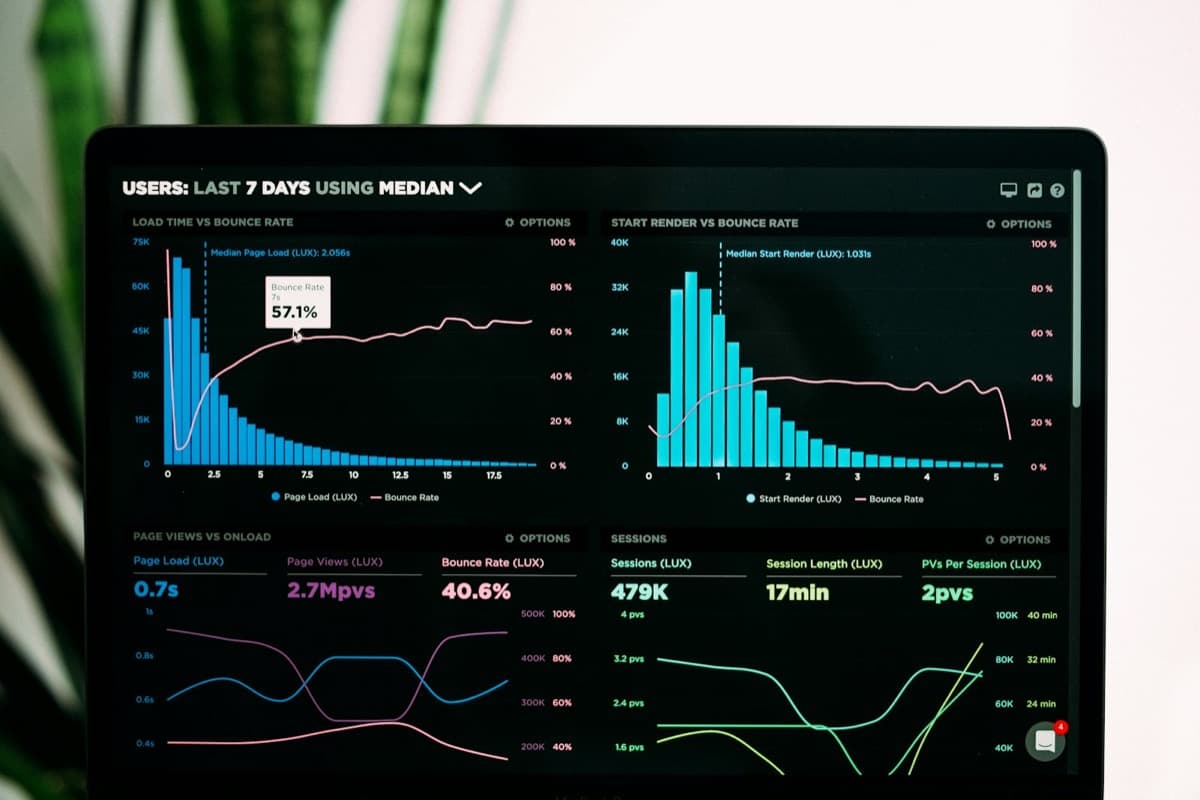
Google's data is unequivocal: when load time goes from 1 to 3 seconds, bounce probability increases by 32%; from 1 to 5 seconds, by 90%. Every second lost before display costs conversions, before your copywriting even gets its chance. Run your page through PageSpeed Insights and aim for an LCP under 2.5 seconds on mobile. The usual culprits: uncompressed images, stacked tracking scripts, bloated themes. It is one reason to choose a modern stack — we compare the numbers in Next.js vs WordPress for a landing page.
Lever 4: specific social proof, not decoration
“They trust us” followed by four logos no longer convinces anyone. Social proof only works under three conditions: specific (a quantified result, a context), embodied (first name, photo, job title) and close to the reader (a coach's testimonial speaks to a coach, not to an e-commerce owner). Place the strongest testimonial just before or just after the price, where doubt peaks. An honest counter (“1,240 entrepreneurs signed up”) works too — provided you never invent it.
Lever 5: reduce form friction
Every form field is a tollbooth. HubSpot and Baymard studies converge: going from 4 fields to 3 can measurably lift conversion, and mandatory “phone” fields are the most destructive (the visitor anticipates cold calls). Simple rule: only ask for what you need for the next step. An email is enough to send a lead magnet; the rest can be collected later. If you need qualification, prefer a two-step form: email first, details second — the first micro-commitment engages psychologically. We dedicated a full guide to this trade-off, field by field: how many form fields does a converting form need.
Lever 6: a CTA that describes the gain, not the action
“Send”, “Submit”, “Register” describe the effort. “Get my guide”, “Book my free call”, “Browse the templates” describe the reward. Complete the button with an anxiety reducer just below: “No commitment”, “Reply within 24 h”, “Secure payment, 14-day refund”. These micro-lines cost one line and remove the final hesitation. To go further, we dissected 12 CTA examples that convert — wording, placement and the psychology behind each one.
Lever 7: honest urgency
Urgency works — loss aversion is one of the most powerful biases — but manufactured urgency destroys trust and may qualify as a misleading commercial practice. The fake countdown that resets on every visit is spotted in ten seconds. Use only real limits: seats limited by your coaching capacity, a dated launch price, a bonus removed on a precise date, a session starting on a given day. True, verifiable urgency converts better than fake urgency, and you can repeat it at every launch without eroding your credibility.
Lever 8: readability and visual hierarchy
- One idea per section, one message per sentence — visitors scan, they don't read.
- Section headings that tell the pitch on their own: read your H2s in a row, they must form a coherent argument.
- Sufficient contrast: dark text on a light background, a button in a colour absent from the rest of the page.
- Paragraphs of 3 to 4 lines maximum on mobile, lists whenever possible.
Lever 9: remove risk at the exact moment of doubt
Guarantee, refund policy, payment security, GDPR: these elements only have an effect if they appear in the right place — right next to the form or the buy button, not relegated to the bottom of the page. A “14-day money-back” guarantee placed under the final CTA can make a measurable difference on a paid offer. On a contact form, a single line — “Your data will never be shared” — is enough to reassure.
Lever 10: ad-to-page consistency
If your ad promises “a free audit” and the page is headlined “Digital marketing agency”, you lose the visitor within a second. Message match — repeating on the page the exact words of the ad or email that generated the click — is one of the most profitable levers in paid traffic. Competitors' ads are public, so checking how they handle it takes minutes: the ad-to-page check is part of our grid for analyzing a competitor's landing page. Ideally, create one page variant per acquisition angle: quick when your page is a duplicable template, tedious when it is a hand-built page.
Lever 11: simple A/B testing (honest about its limits)
No need for heavy machinery. A useful A/B test is: one single variable (the headline, the CTA or the hero visual — the high-impact elements), a measured goal (conversion, not clicks), and enough volume. Let's be honest: under 1,000 visitors per variant, your results will often be statistical noise. If your traffic is low, replace A/B testing with sequential tests (two weeks version A, two weeks version B) and above all with 5 qualitative user tests: watching five people use your page reveals more problems than three months of data.
Lever 12: measure before optimising
- Install a GDPR-friendly analytics tool and measure your current conversion rate — you can't improve what you don't measure.
- Add a heatmap or session recording (Microsoft Clarity is free) to see where visitors drop off.
- Identify THE main leak: 60% leaving without scrolling = hero problem; massive form abandonment = friction problem.
- Fix that point, measure for two weeks, then move to the next. One lever at a time.
Where to start?
If you only pull three levers this week: speed (lever 3), the single CTA (lever 2) and clarity above the fold (lever 1). These are the foundations — the other nine optimise a page that already works; they won't save a slow, confusing one. And remember that structure matters as much as optimisation: reread the 9 essential sections of a landing page if yours strays too far from the blueprint.
The LanderKit templates build these levers in from the start: ultra-fast static pages (LCP well under 2.5 s), a single repeated CTA, social proof and guarantee sections in the right places, forms cut to the minimum. Whether you are launching a SaaS waitlist or an e-commerce product page, you start from a base above market standards — all that's left is to plug in your message and your proof.
FAQ
Frequently asked questions
What is a good conversion rate for a landing page?
The average sits between 2 and 5% depending on the industry, with a median close to 4% in the major market studies. Above 7%, your page is among the best. Bear in mind that the rate depends heavily on the offer (free or paid) and traffic quality — compare against your own history before comparing against benchmarks.
Which lever should I pull first when short on time?
Loading speed and hero clarity. A page that takes 5 seconds to display, or whose offer can't be understood in 5 seconds, loses most of its visitors before anything else matters. Run PageSpeed Insights and do the 5-second test with an outsider: both diagnoses take ten minutes.
Is A/B testing worth it with low traffic?
Below roughly 1,000 visitors per variant, A/B test results are rarely statistically reliable. With low traffic, prefer sequential tests (one version for two weeks, then the other) and above all qualitative user tests: watching five people browse your page reveals blockers far faster than statistics.
Should I remove the navigation menu on a landing page?
Yes, in the vast majority of cases. A landing page has a single goal, and every menu link is a possible exit before conversion. Keep only the logo (possibly non-clickable) and the mandatory legal links in the footer. A/B tests on this point are among the most consistent in the trade: fewer exits, more conversions.
Read next
Related articles
- Multi-step form or single form? What the foot-in-the-door technique tells usAsking for a first name before asking for a phone number isn't a UX detail: it's an engagement mechanism documented since 1966. Here's when a multi-step form wins, and when it just adds unnecessary complexity.
- Legal requirements for a landing page: GDPR, cookies, legal notice, VAT, accessibilityA landing page that collects emails or sells online is subject to about ten obligations. This guide gathers them in one place, with what to display and what to avoid for each.
- Landing page pricing in 2026: how much does it really cost?From €89 to €10,000, the price gap for a landing page is dizzying. A comparison table of the 4 options — freelancer, agency, page builder, template — and the factors that drive the bill up or down.